Useful Systems, Inc.
Branding
Typography
animation
illustration
Website design
Copywriting
brand manual
social imagery
marketing collateral
email templates
—
The Useful app was built for the field service industry (roofers, plumbers, electricians, landscapers, etc.) aimed at providing a mobile solution for a highly mobile workforce. Many apps in the space were built on old technology and weren’t mobile-first.
We came into the project in 2014. There was already an app in the market and the team had tripled it’s engineering staff so it was time to get busy with rolling out some new stuff.

Our approach throughout the project was to build on the initial concept. There wasn’t any reason to overhaul the entire app, but to provide new insights and continue to enhance the user’s mobile experience. The product needed to grow to support key features and new user goals, but also needed to continue to be something useful.
Art Direction + Design:
Jaron Jackson
Design + Illustration
Tyler Zenk
tylerzenk.com
Copywriting
Leslie Donnenwirth
Content Marketing
DJ Francis
hubspoke.marketing

Tightening up the Identity
Logo updates
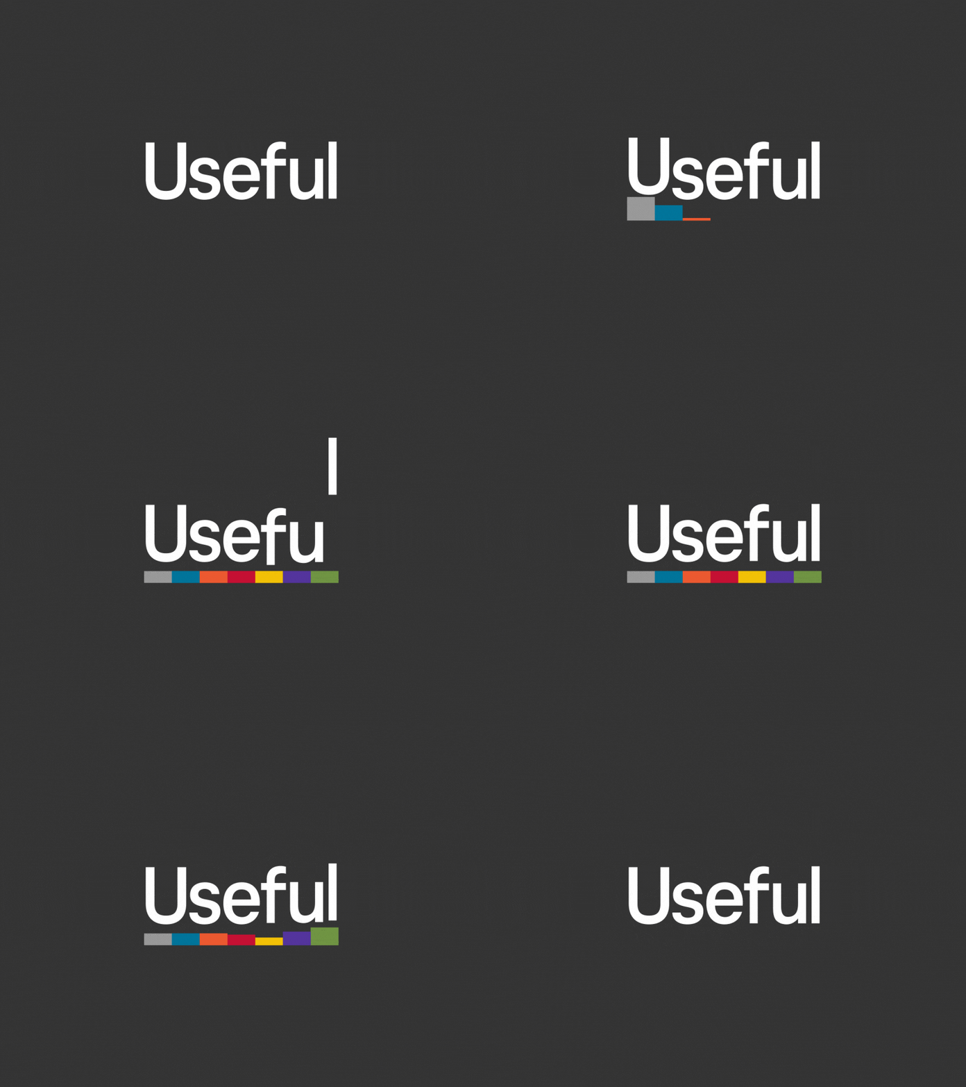
Understanding the background behind the original logo, we didn’t want to come in and uproot what had been established. We focused on what would be the best decisions we could make to scale the brand. First we fixed a couple of characters in the wordmark. Then we addressed color by brightening up the existing color palette and providing a one color variation so we could use the identity in any medium.


Animations
Of course we had to have a little fun with it.


Typography
Typography
When picking the right font it’s hard to not get lost in the void of the many that are out there. We used samples of the type they had used in the past and decided to update with Bebas Neue and Roboto. Both checked back to attributes of the brand.
Bebas Neue
Has clean lines that blend technical straightforwardness and warmth.


Roboto
Has friendly open curves and make it easier for reading. A commonly found in humanist and serif types.


Extending the brand
Badges, patches and crests…
Donec sed odio dui. Nulla vitae elit libero, a pharetra augue. Curabitur blandit tempus porttitor. Maecenas sed diam eget risus varius blandit sit amet non magna. Lorem ipsum dolor sit amet, consectetur adipiscing elit.


New visual language
Iconography
Adding a little personality
Illustration
Cum sociis natoque penatibus et magnis dis parturient montes, nascetur ridiculus mus. Fusce dapibus, tellus ac cursus commodo, tortor mauris condimentum nibh, ut fermentum massa justo sit amet risus. Aenean lacinia bibendum nulla sed consectetur. Nullam id dolor id nibh ultricies vehicula ut id elit. Vestibulum id ligula porta felis euismod semper. Integer posuere erat a ante venenatis dapibus posuere velit aliquet. Aenean eu leo quam. Pellentesque ornare sem lacinia quam venenatis vestibulum.
— PERSONAS

— SOCIAL & EMAIL

Being us
Brand manual
Nullam quis risus eget urna mollis ornare vel eu leo. Lorem ipsum dolor sit amet, consectetur adipiscing elit. Donec sed odio dui. Morbi leo risus, porta ac consectetur ac, vestibulum at eros. Sed posuere consectetur est at lobortis. Duis mollis, est non commodo luctus, nisi erat porttitor ligula, eget lacinia odio sem nec elit.


MAPPING OUT THE DEPTH OF THE APP…
With this exercise we wanted to make sure we could facilitate any user’s core actions and understand how far they are away from them. In addition to this, the user would have other contextual actions depending on the view and the content displayed.
TEST, ITERATE AND TEST AGAIN…
Once we got this set up, we started to move content into the designs to see how and when our mapping would breakdown and when there should be exceptions.

SUB-HEADER
HEADER
Etiam porta sem malesuada magna mollis euismod. Maecenas faucibus mollis interdum. Donec sed odio dui. Lorem ipsum dolor sit amet, consectetur adipiscing elit.